Someone clicks your ad, your social post, or your email link. Where do they land? If the answer is your homepage, you are probably wasting money. Smart marketers send that click to a page built for one job. That page is a landing page, and understanding what is a landing page — and how to build one that converts — can transform the results of every campaign you run.
In this guide you will learn what a landing page is, how it differs from a normal web page, the elements every high-converting page needs, and a simple process for creating your first one, even with no design experience.
What Is a Landing Page?
A landing page is a standalone web page created for a specific campaign or offer, designed to persuade a visitor to take one action. That action might be signing up for a newsletter, downloading a guide, booking a call, starting a free trial, or buying a product. Everything on the page supports that single goal.
The key word is focused. A homepage welcomes everyone and links everywhere. A landing page welcomes one audience, with one promise, and one next step. That focus is why landing pages sit at the center of any modern digital marketing strategy for small businesses that relies on paid or email traffic.
Landing Page vs. Homepage: What Is the Difference?
A homepage is a hub. It introduces your brand, links to dozens of pages, and serves visitors at every stage of interest. That flexibility is useful, but it also creates exits everywhere. Every extra link is a chance for a campaign visitor to wander off and forget why they came.
A landing page strips those exits away. Navigation is minimal or removed, the message matches the ad or email that sent the visitor, and the call to action repeats from top to bottom. Marketers who measure results carefully, using a data-driven approach to revenue and marketing, consistently find that this focus lifts conversion rates compared with sending traffic to general pages.
The Anatomy of a Landing Page That Converts
A Headline That Matches the Promise
Your headline must echo the ad, post, or email that brought the visitor. If the ad promised a free home valuation, the headline should say exactly that. Any mismatch feels like a bait and switch, and visitors leave within seconds. Keep the headline benefit-led and specific.
A Supporting Subheadline
The subheadline adds one clarifying detail: who it is for, how it works, or how fast it happens. Together, headline and subheadline should answer “What do I get, and why should I care?” before the visitor scrolls at all.
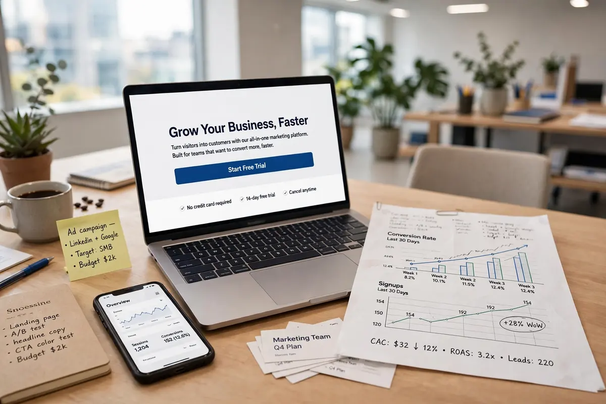
One Clear Call to Action
Your call to action (CTA) is the button or form you want visitors to complete. Use action words that describe the outcome, such as “Get My Free Guide” instead of “Submit.” Repeat the same CTA after each major section, and never offer two competing actions of equal weight. This single-focus discipline is a recurring theme in the playbook used by high-growth advertising firms.
Benefits, Not Just Features
List what the visitor gains, in their language. Three to five short benefit points, each with a supporting detail, work well. If you are offering software, talk about hours saved, not server architecture. If you are selling a service, talk about the outcome and the relief it brings.
Proof That Lowers Risk
Visitors ask one silent question: “Can I trust this?” Answer it with testimonials, review counts, client logos, guarantees, or security badges where relevant. Even one honest quote from a real customer outperforms a paragraph of your own claims. Pages built during a wider digital transformation of business services often standardize this proof section across campaigns.
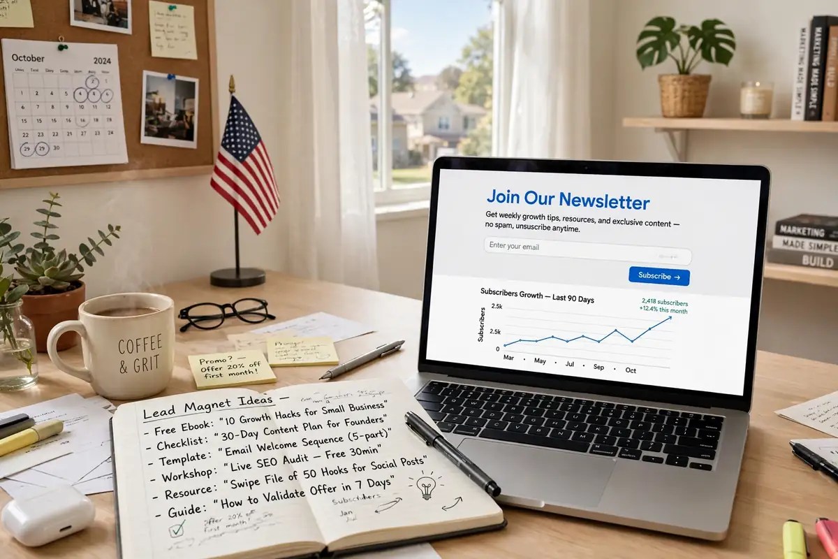
A Simple Form
Every extra form field costs you completions. Ask only for what you truly need at this stage. For a guide download, a name and email are usually enough. Save detailed questions for later in the relationship, when trust is higher.
A Relevant, Honest Image or Video
Show the product, the result, or the people behind the offer. A short video explaining the offer can lift conversions further, but only if it loads fast and has captions, since many visitors watch with the sound off.
How to Make a Landing Page Step by Step
Step 1: Define the single goal. Write it in one sentence: “Get kitchen remodel leads in Austin to book a free consultation.” Every decision after this gets easier.
Step 2: Know the visitor’s mindset. Where did they come from, and what do they already believe? Cold ad traffic needs more explanation and proof than warm email subscribers. Businesses practicing small business excellence in digital marketing map this mindset before writing a single word.
Step 3: Write the copy first. Draft headline, subheadline, benefits, proof, and CTA before touching a design tool. Words persuade; design presents. If the copy is weak, no template will save the page.
Step 4: Build with a proven template. Every major website platform and email provider offers landing page templates. Choose a clean, mobile-first layout, add your copy, and remove anything that does not serve the goal. Founders following a step-by-step ecommerce launch guide will recognize this lean, test-first mindset.
Step 5: Check speed and mobile layout. Most campaign traffic is mobile. Test the page on your own phone: does the headline fit, is the button thumb-friendly, does the form work? Slow pages quietly kill campaigns, especially paid ones where every click costs money.
Step 6: Connect tracking before you launch. Know exactly how you will measure views, clicks, and conversions. Connect the page to your analytics and your email or CRM tool so leads land in the right place. This is where marketing automation practices help even small teams follow up quickly.
Step 7: Test one change at a time. After launch, improve the page with small experiments: a new headline, a different CTA, more proof. Change one element, gather results, and keep the winner. Over a few months, these small wins compound into a page that far outperforms your first version.
What to Put on the Thank-You Page
The page a visitor sees after converting is part of the landing page experience, and most businesses waste it. A good thank-you page confirms exactly what happens next: check your inbox, expect a call within one business day, or watch for a shipping notice. Clear expectations reduce anxious emails and refund requests.
It is also the one safe place to offer a second step, because the primary goal is already complete. Invite the new lead to follow your social accounts, read a helpful guide, or book the next appointment. The visitor is at peak trust, so a gentle, relevant suggestion performs far better here than a second competing CTA would have on the main page.
Landing Pages for Local Services
Local businesses get extra value from dedicated pages. A plumber running ads for “water heater repair” in Dallas should land clicks on a page about water heater repair in Dallas, with local reviews, service-area details, and a click-to-call button, not a generic homepage. Relevance this specific is what turns ad spend into booked jobs, and it mirrors the local focus seen in breakdowns of digital marketing ROI for Atlanta businesses and other city-level campaigns. Build one page per core service and city, keep each genuinely useful, and your ads and organic listings reinforce each other.
Common Landing Page Mistakes
- Sending campaign traffic to the homepage. The message match disappears and so do conversions.
- Two goals on one page. “Buy now” and “book a call” together usually achieve neither.
- A long, greedy form. Ask for the minimum now; qualify later.
- No proof. Claims without evidence feel risky to a stranger.
- Slow load times. Every extra second costs you visitors you already paid to reach.
- Forgetting the thank-you step. Confirm the action, set expectations, and suggest the next step.
These errors are expensive for any business, and especially for owners still managing tight digital advertising budgets and assets where each wasted click reduces what the business can invest elsewhere.
Frequently Asked Questions
Do I need a separate landing page for every campaign?
Ideally, yes for major campaigns. Each audience and offer deserves its own message match. You can reuse a template and structure, changing the headline, benefits, and proof to fit each campaign.
How long should a landing page be?
Long enough to answer the visitor’s questions and overcome their main objections. A free download may need only a few sections; a high-priced service usually needs more detail, more proof, and an FAQ.
What is a good conversion rate for a landing page?
It varies widely by industry, offer, and traffic source, so beware of universal benchmarks. Focus on beating your own previous results through steady testing rather than chasing someone else’s number. Teams that track this way, as in studies of digital marketing ROI for businesses, make better decisions than those chasing averages.
The Bottom Line
A landing page is a focused tool: one audience, one promise, one action. Build it with a matching headline, clear benefits, honest proof, a short form, and a single repeated call to action. Then measure, test, and improve it like the asset it is. Whether your campaigns are local or your team works across borders, as in mastering digital marketing in the remote economy, the focused page will quietly outperform the general one almost every time. Build your first landing page this week, and let focus do the persuading.