
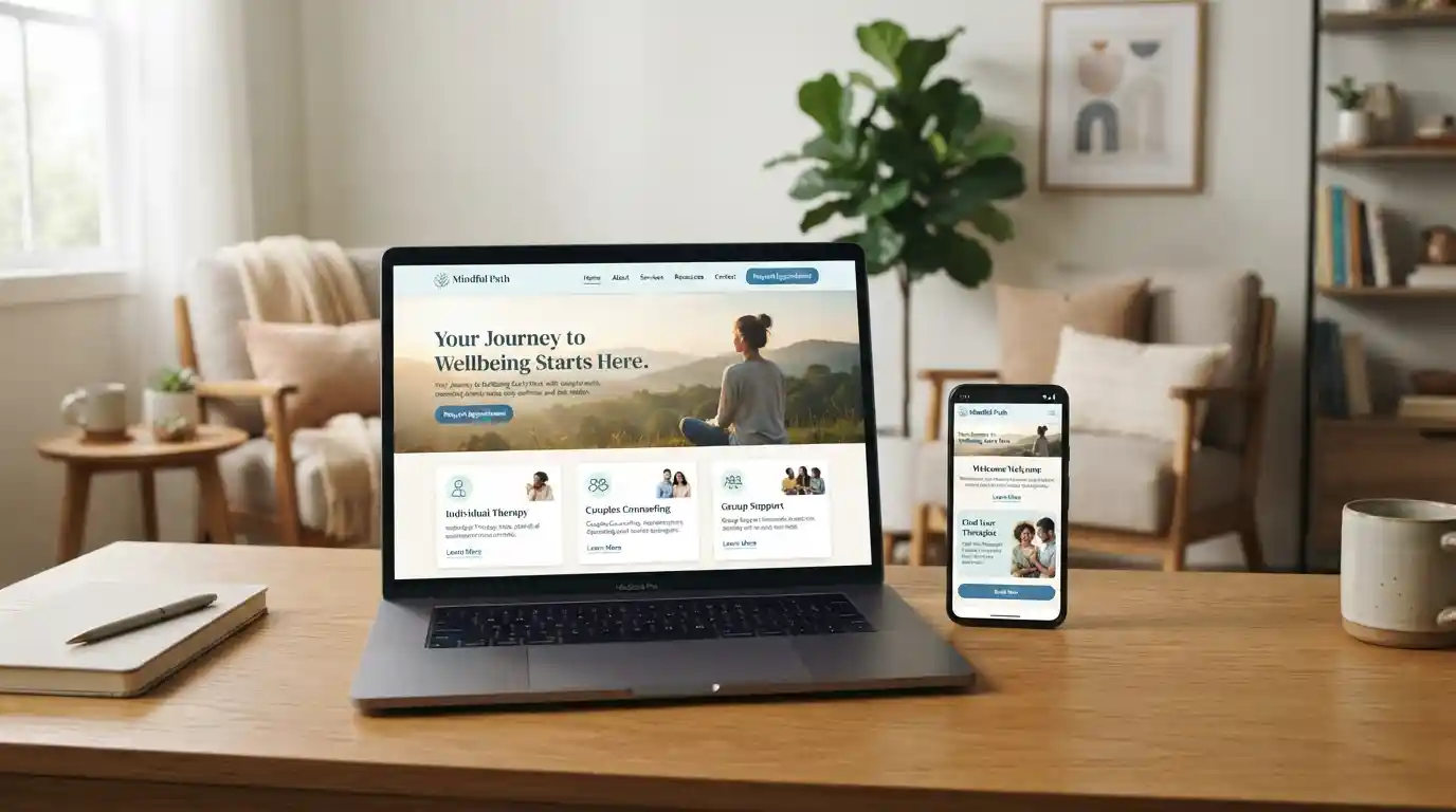
A mental health website cannot replace therapy, counseling, psychiatric care, or other professional services. It can, however, make the journey toward appropriate support easier. A well-designed site can reduce unnecessary friction, explain available services clearly, answer common questions, and help visitors understand what to expect.
This matters because people seeking mental health support may already feel overwhelmed, uncertain, embarrassed, or mentally exhausted. A complicated website adds another barrier. A thoughtful digital experience can instead create a calmer path from searching for information to finding an appropriate provider or service.
Why Mental Health Website Design Matters
Most websites compete for attention. Mental health websites have another responsibility: they need to communicate reassurance and clarity while helping visitors make potentially important healthcare decisions.
The first impression is often created within seconds. Visitors may immediately look for answers to practical questions such as:
- What mental health services are available?
- Who provides the care?
- How can I make an appointment?
- Do you offer virtual or in-person appointments?
- Do you accept insurance?
- What should I expect during the first appointment?
- How can I contact someone if I need help?
If those answers are difficult to locate, a visitor may leave before making contact. By contrast, clear information architecture and straightforward calls to action can make the process easier to understand.
This principle also applies to broader health websites. For example, content about home health services needs to communicate practical information quickly, while a resource focused on healthcare access needs to make navigation and service information easy to understand.
A Mental Health Website Should Feel Approachable
Design choices can affect how a visitor interprets a healthcare organization. A cluttered interface, aggressive pop-ups, confusing menus, or overly technical language can create unnecessary cognitive load.
A more effective approach is to create a visual hierarchy that tells visitors where to look first. The homepage should quickly establish what the organization does, who it serves, and how someone can get started.
That does not mean every mental health website needs to look identical. Different practices may serve different communities, age groups, conditions, and treatment needs. The design should reflect the audience while maintaining clarity, professionalism, privacy, and accessibility.
Clear Navigation Reduces Friction
Navigation is one of the most important elements of mental health website design. Visitors should not have to explore several layers of menus to find basic information about services or appointments.
A useful primary navigation structure might include:
- Services
- Conditions or areas of support
- About the providers
- Appointments
- Insurance and fees
- Resources
- Contact
Important actions should also remain visible on mobile devices. Someone searching for support from a smartphone should be able to find a contact method or appointment option without excessive scrolling.
This emphasis on straightforward digital experiences connects with broader digital transformation in business services, where usability and accessibility are increasingly important parts of the customer experience.
Use Plain Language Instead of Clinical Jargon
Mental health terminology can be complicated. Although clinical terminology is sometimes necessary, a public-facing website should explain services in language that ordinary visitors can understand.
Instead of filling pages with specialized terminology, websites can use short paragraphs, descriptive headings, bullet points, FAQs, and concise explanations.
For example, a service page can explain what a treatment involves, who may benefit from it, what the first appointment typically covers, and how visitors can request more information.
The same principle is valuable when discussing mental health awareness. A resource such as Teen Mental Health Month benefits from accessible language because its potential audience may include teenagers, parents, educators, and other people with different levels of familiarity with mental health terminology.
Design for People Who May Be Overwhelmed
A mental health website should assume that not every visitor arrives with unlimited attention or patience. Some people may be anxious, distressed, tired, distracted, or uncertain about what kind of support they need.
That makes simplicity particularly valuable.
Good design can help by:
- Keeping important information easy to scan.
- Using descriptive headings.
- Breaking long information into manageable sections.
- Providing obvious next steps.
- Reducing unnecessary animations and distractions.
- Making forms as short and understandable as possible.
- Providing contact information in predictable locations.
The goal is not to make the website empty. The goal is to make useful information easier to process.
Accessibility Should Be Built Into the Design
Accessibility should not be treated as a final technical checklist. It should be considered from the beginning of the design process.
Visitors may use screen readers, keyboard navigation, browser zoom, mobile devices, alternative input methods, or other assistive technologies. A website that works only for visitors using a particular device or interaction style can create avoidable barriers.
Practical accessibility considerations include sufficient color contrast, descriptive link text, meaningful headings, keyboard-friendly navigation, readable typography, appropriate form labels, alternative text for informative images, and responsive layouts.
Accessibility also includes the language and organization of information. A visually attractive website can still be difficult to use if visitors cannot understand its instructions.
This broader idea of inclusive digital experiences is also relevant to mental health digital design itself: the interface should support the person using it rather than forcing the person to adapt to a complicated system.
Mobile-First Design Is Essential
People increasingly search for information through smartphones. Mental health organizations therefore need websites that work comfortably on smaller screens.
A mobile-friendly mental health website should use readable text, appropriately sized buttons, simple menus, fast-loading pages, and forms that do not require excessive typing or zooming.
Appointment and contact actions deserve particular attention. If a visitor has already decided to reach out, the website should not make the final step unnecessarily difficult.
Mobile-first thinking is also relevant to digital health more broadly, where online tools need to accommodate different devices, levels of digital literacy, and accessibility requirements.
Make Appointment Information Easy to Find
One of the most important goals of a mental health website is helping people understand how to access services.
An appointment page should answer practical questions before asking the visitor to complete a form. Depending on the organization, useful information can include appointment types, provider availability, insurance information, accepted payment methods, telehealth options, location details, preparation instructions, and expected next steps.
Visitors should also understand what happens after submitting a request. A simple message explaining when and how the organization typically responds can reduce uncertainty.
Healthcare-focused websites such as health center resources demonstrate why service information needs to be organized around the visitor’s questions rather than solely around the organization’s internal structure.
Build Trust Without Making Unrealistic Promises
Trust is particularly important when a website represents mental health services. Visitors need enough information to make informed decisions without encountering exaggerated claims.
A trustworthy website can introduce qualified providers, explain professional roles, describe services accurately, provide transparent contact information, and communicate policies clearly.
Testimonials may be appropriate in some contexts, but they should never create the impression that a particular outcome is guaranteed. Mental health experiences differ from person to person, and website copy should respect that reality.
The same principle applies to health and wellness content. A page such as health and wellness resources should focus on useful information rather than making unsupported promises.
Privacy Should Be Visible
Privacy is a major consideration for people interacting with mental health organizations online. Visitors may hesitate to submit information if they do not understand how their data will be handled.
Websites should therefore make relevant privacy information easy to locate. Forms should request only information that is necessary for their intended purpose, and organizations should clearly communicate how visitors can contact them with questions about privacy.
Security also matters at the technical level. Websites should use appropriate safeguards and keep software, plugins, integrations, and forms properly maintained.
Privacy is not merely a legal or technical issue. It is part of the overall user experience because visitors need to feel confident before sharing sensitive information.
Use Visuals That Support Calm and Clarity
Images can strengthen a mental health website when they reinforce the site’s purpose. Natural environments, welcoming spaces, diverse people, professional interactions, and authentic staff photography may help communicate warmth and approachability.
However, visuals should not become decorative distractions. Stock photographs that look staged or disconnected from the actual organization can reduce credibility.
Visual consistency also matters. Typography, spacing, imagery, buttons, colors, and page layouts should feel like parts of the same experience.
Designers working on health-related websites can also learn from broader mental health web design principles by focusing on the relationship between visual presentation, usability, trust, and accessibility.
Content Architecture Matters as Much as Visual Design
A beautiful website can still fail if its content is poorly organized. Mental health organizations often have many services, specialties, providers, resources, and educational pages, so information architecture deserves careful planning.
Instead of putting everything on one enormous page, related information can be organized into focused sections. For example, a practice could separate therapy services, medication management, family support, youth services, provider information, insurance details, and educational resources.
This makes the website easier to navigate and also creates opportunities for contextual internal linking between related pages.
Strong content architecture is closely connected to broader digital marketing strategy because search visibility becomes more useful when visitors can easily move from informational content toward relevant services.
SEO Should Support the User Experience
Search engine optimization can help mental health organizations become easier to discover, but SEO should not take priority over the visitor’s needs.
Useful SEO foundations include descriptive page titles, clear headings, relevant terminology, helpful content, fast performance, mobile usability, descriptive URLs, internal links, and accurate metadata.
Content should also reflect the questions people genuinely ask. Instead of producing pages simply because a keyword has search volume, organizations can build resources around practical concerns such as finding a therapist, understanding treatment options, preparing for an appointment, or learning how different services work.
Organizations developing a broader online strategy can also consider principles discussed in advanced digital marketing and business transformation, particularly the relationship between digital channels and measurable business outcomes.
Connect Educational Content With Services
A mental health website should not force every visitor directly toward an appointment. Some people may be researching a concern, supporting a family member, comparing options, or simply learning more.
Educational content can provide value at this stage. The website can then offer relevant next steps without being overly promotional.
For example, an educational article about stress could naturally connect readers with information about counseling services. A page about adolescent wellbeing could point parents toward youth-focused resources. This creates a helpful content journey rather than a collection of disconnected pages.
Even broader content about mental health and everyday wellbeing can contribute to a useful resource library when it is accurate, responsibly written, and clearly separated from professional treatment advice.
Use Forms Carefully
Contact and intake forms can make it easier for visitors to reach a practice, but unnecessarily long forms may discourage completion.
Start by determining what information is genuinely needed at that stage of the journey. Nonessential questions can often be postponed until an appropriate intake process.
Forms should also explain required fields, display understandable error messages, work properly on mobile devices, and provide a clear confirmation after submission.
The overall objective is simple: make it easy for someone to take the next appropriate step without creating additional confusion.
Measure What Visitors Actually Do
Website performance should not be judged only by traffic. A mental health organization may receive thousands of visits but still have a poor website experience if visitors cannot find services or complete appointment requests.
Useful performance indicators can include:
- Appointment-request completion rate.
- Contact-form completion rate.
- Clicks on phone or email links.
- Engagement with service pages.
- Mobile versus desktop behavior.
- Frequently visited resource pages.
- Pages where visitors commonly leave.
These insights can inform iterative improvements rather than relying entirely on assumptions about what visitors want.
This measurement mindset also aligns with digital marketing for small-business excellence, where digital performance should ultimately be connected to meaningful outcomes.
Test the Website With Real Users
Design teams should not assume that a website is easy to use simply because it looks simple to the people who built it.
User testing can reveal problems that internal teams overlook. A small group of representative users can be asked to perform practical tasks such as finding a therapist, locating insurance information, identifying appointment options, or finding contact details.
Watch where users hesitate. Pay attention to the language they misunderstand and the information they expect to find but cannot locate.
Testing should also include mobile devices and accessibility considerations. Improvements can then be made through an iterative design process.
A Mental Health Website Is Part of the Care Journey
Calling a website a “therapy couch” is a metaphor, not a clinical claim. A website cannot provide the human relationship, assessment, professional judgment, or individualized care that therapy and other mental health services can provide.
What a website can do is shape the journey before and around that care. It can help someone understand their options, find relevant information, identify an appropriate service, prepare for an appointment, and feel more confident about reaching out.
That is why mental health website design deserves the same careful attention given to other parts of a healthcare experience.
The Future of Mental Health Website Design
Digital mental health experiences are likely to continue evolving as organizations combine websites, telehealth, online resources, patient portals, educational content, and other digital tools.
The most useful websites will not necessarily be the ones with the most features. They will be the ones that understand their users and remove unnecessary barriers.
That means prioritizing accessibility, plain language, privacy, mobile usability, clear navigation, transparent service information, thoughtful content, and continuous testing.
For organizations developing their broader digital presence, ideas from digital marketing in the remote economy can also help demonstrate why digital experiences need to remain flexible as user behavior changes.
Final Thoughts
Effective mental health website design is ultimately about people rather than pixels. A polished visual identity is valuable, but the deeper goal is to create an experience that is understandable, accessible, trustworthy, and easy to navigate.
When visitors can quickly understand what services are offered, who provides them, how to make contact, what to expect, and where to find additional information, the website becomes a useful bridge to care.
That is the real opportunity behind better mental health web design: not to replace therapy, but to make the path toward appropriate human support clearer and less intimidating.